
Fire TV Live TV Sources
Lead UX Designer
Platform: Fire TV OS
Problem
We have a business goal to increase Live TV’s customer base on Fire TV, however, a challenge customers face today is they don’t know how to get Live TV channels. With the desire of 3P partners to integrate into Live TV’s guide to educate customers on their content and offerings, we need a way for customers to discover new content that can populate their guide, as well as have autonomy over what content is accessible in their guide.
Common terminology
When working with TV and on a product aggregator like Fire TV, there are a few customer states that are super common, but not necessarily intuitive.
Entitled
When we refer to an ‘entitled’ customer — that means a customer who can watch the content offered. For example, if a customer pays for a Netflix subscription, they are entitled to watch the content from Netflix. Additionally, if a customer downloads a free service (like IMDb TV) and is correctly signed up, they are also entitled to that content.
Unentitled
Conversely, if a customer is seeing content from a service they do not pay for (or have downloaded/signed up for free services), they are not entitled to watch that content and would require a further payment or action to successfully watch the content. In this state, we refer to the customer as unentitled.
3P partners
Whenever we refer to ‘3P partners’, we are referencing external, third-party partners who we have a relationship with. Examples of these parters are Netflix, YouTube TV or HBO.
Existing experience & painpoints
Live TV guide
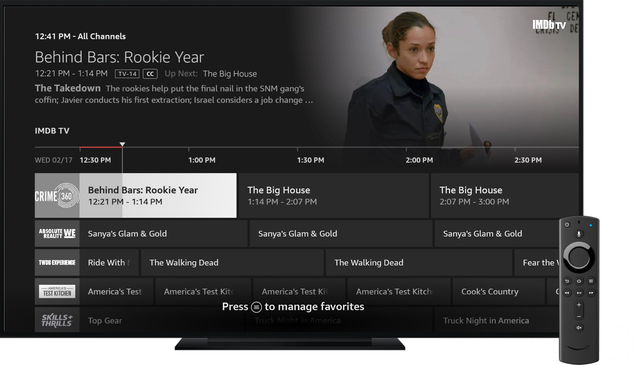
Taking a look at the existing experience, there are a few clear painpoints that prevent users from finding Live TV services and using them on Fire TV:
Painpoint 01
No clear contextual ingress for users to add channels
Painpoint 02
We don’t have any visual affordance to indicate whether content is entitled or not to users
Painpoint 03
Lacks education about where this content is coming from, and how to add other content to the guide
Requirements
-
Allow users to turn services on/off
To help promote customization within Live TV, we need to empower users to tailor the experience to their preferences. Users need a quick and discoverable mechanism to control the content and providers they see in their guide.
-
Have a meaningful default CX
For users who haven’t subscribed to any Live services or channels yet, the guide should expose free content and have easy paths for users to discover content from other services that may be relevant to them.
-
Provide contextual information as the user interacts with the experience
As the customer browses various content and channels, we should be adding supplementary information to help customers make informed decisions, while not interfering with the browse and watch experience.
-
Help customers to complete downloads quickly
If a user decides to subscribe to a Live TV app, we should streamline the download process to get them to the content they want as fast as possible. We should reduce friction for users to help increase conversion metrics.
-
Give users a programming peek
Although the future goal is to allow users to preview content before they subscribe to a service, the near-term idea is to allow users to see what content is playing in the guide on services they are not yet entitled to. This will help inform users what content is being offered in hopes of helping users build a Live TV experience that best aligns with the content that matters to them most.
Hypothesis
Surfacing Live TV services higher up in the live experience and giving customers the ability to customize their lineup by quickly adding and hiding content will help customers build their lineup sooner — as well as increase engagement and conversion on Fire TV’s Live TV.
Driving data points
7%
of customers enter ‘playback’ (the video player when a user selects content) from the Live tab. This means we either aren’t showing customers content that matters to them, or helping them discover the right content for them.
40%
the estimated growth in American households that cut the cord (ditch cable Live TV and subscribe to an OTT service). This makes Live TV content even more relevant to Fire TV and increases the need for an experience that helps customers ditch cable and find the right service for them.
25M
Fire TV devices worldwide that have a Live TV experience. That means we need to design an experience that is scalable across different markets and types of Live TV services.
Explorations
In-line guide explorations
Since one of the goals was to help users discover new content and services to encourage them to build up their Live TV experience, I thought exploring ingresses in-line with the actual guide would be a good place to start. Below are a few of my explorations:
01
Monetized app component with programming peek
In this exploration, the idea was to have a row in-line with the free content that surfaced unentitled services and their content. As the user would navigate across the row of services, they would see a programming peek of content to help the user decide if this was a service they were further interested in. We’d also include a dynamic ingress to download the service in focus. This is also an opportunity to monetize for the business, as we could choose to prioritize which services might be displayed earlier in the row.


Pros
01
Allows for a visually differentiated component for unentitled services
02
Introduces a business opportunity for monetization
03
Allows user to browse top channels from each service
Cons
01
Not scalable for all available services
02
Creates a break in the guide and might be confusing for customers
02
Monetized 3P informational modal
With this exploration, the idea is to still surface unentitled services in the guide to create a contextual opportunity for users to add to the content already in their guide. However, this approach is a little more lightweight. Instead of including programming previews in-line in the guide, additional information would live in a modal if the user wanted to discover the service further. This would also allow us to be able to show more information about the service and its programming since we aren’t relying on the tight space within the guide to display it.


Modal exploration 01

Modal exploration 02
Pros
01
Allows for a unique affordance for 3P services to promote discoverability
02
Opportunity for monetization
03
More lightweight visual treatment to keep guide consistency
Cons
01
Not scalable for all services
02
Might not be discoverable that far down in the guide
03
Might provide too little information about each service at a glance
03
Category ingress to add channels
To try something different, I did an exploration where we are using an existing system-browse component to allow users to browse by content-interest. There is an education element missing from the Live TV experience for users who don’t have awareness to all the available services, and finding the right service for them may be a challenge. This exploration lets users view various services based on their interests, and gives them a peek as to what channels each one offers to ensure the service they choose will have the content that matters to them most.


Pros
01
Utilizing an existing component in our design system
02
Contextually and dynamically shows offered channels based on user selection
03
Allows user to browse content by interest
Cons
01
Introduces an additional click for users to see service information
02
Because it looks like another browse row, it may not be discoverable to the user
04
Imbedded toggle for channels
With the goal of exploring the concept of a user’s autonomy over their guide, I explored the concept of users choosing whether or not they want to see additional, unentitled services in their guide. This gives the user a quick and effective way to alter the content that they see in the guide, and allows them to choose whether or not they want to discover something new, or hide that content and focus on the programming that is currently in their guide.

Toggle on
Toggle off
Pros
01
Allows users to control their guide with one click
02
Consistent guide patterns to not distract from the content in the guide
Cons
01
Toggle may not be discoverable
02
Does not give users additional information on the service
Design feedback
After reviewing these various designs with other designers and product and engineering stakeholders, I got a good enough amount of feedback to help me narrow my direction for the MLP (‘minimum lovable product’). Below are the overarching feedback points I received:
Altering the channel lineup in-line might be too robust for the original purpose of the guide.
Because the guide can potentially house lots of channels, adding in functionality to turn on/off channels might be confusing and not intuitive for the user. They may expect that type of functionality to live elsewhere in the experience.
We can help users find the services that interest them, but it’s not up to us to help sell 3P services.
Although it’s important for users to be able to find certain apps and services easily, it’s not up to Fire TV to “sell” those services. We should focus on showing users the content they play, but worry less about subscription nuances.
This feature may need more prominence in the Live TV CX — discoverability could be difficult if it’s too contextual.
If this experience is solely embedded in the guide like some of the previous explorations, we may not be creating a feature that has a reliable location in experience. Users should be able to navigate to this feature outside of the guide.
Finetuned use cases & iterations
-
![]()
Use case 1: I have no channel subscriptions and am not sure where to start.
We decided to zero in on the use cases to better understand the user’s perspective when they are trying to add channels to their lineup. The user may have just bought their Fire TV device and are setting it up while exploring the various parts of the experience; or, the user may have had their Fire TV device for awhile, but have just discovered the capabilities of Live TV and want to add channels that they can easily watch.
-
![]()
Use case 2: I have so many channels and I don't watch them all. I want a way to curate and manage all of my available channels.
Some users can have channels coming from multiple providers, creating a long list of channels to sift through; although a few may only be meaningful. Those users want an easy and quick way to find the channels that matter most, while getting rid of the channels in their lineup that they don’t care about.


Continued design explorations
After the initial round of design explorations and further defining the customer use cases, I concluded this feature will need to live outside of the guide. With that conclusion, I explored different treatments that could live outside of the guide, while still providing contextual information and allowing users to have power over what content from services they see in their guide.
01
App information cards

01 | Entitled
A service that a user currently has hidden.

02 | Entitled
A service that a user currently has that is entitled and showing.

03 | Unentitled
An unentitled service that does not have a preview available, and requires a download for a user to see the content.

04 | Unentitled
An unentitled service that has a preview and doesn’t require a download.
05 | Unentitled
For a service that doesn’t have a preview available, the user will be sent to the app download page to download and subscribe.

06 | Unentitled
When a user successfully adds a service with a preview to their lineup in their guide.
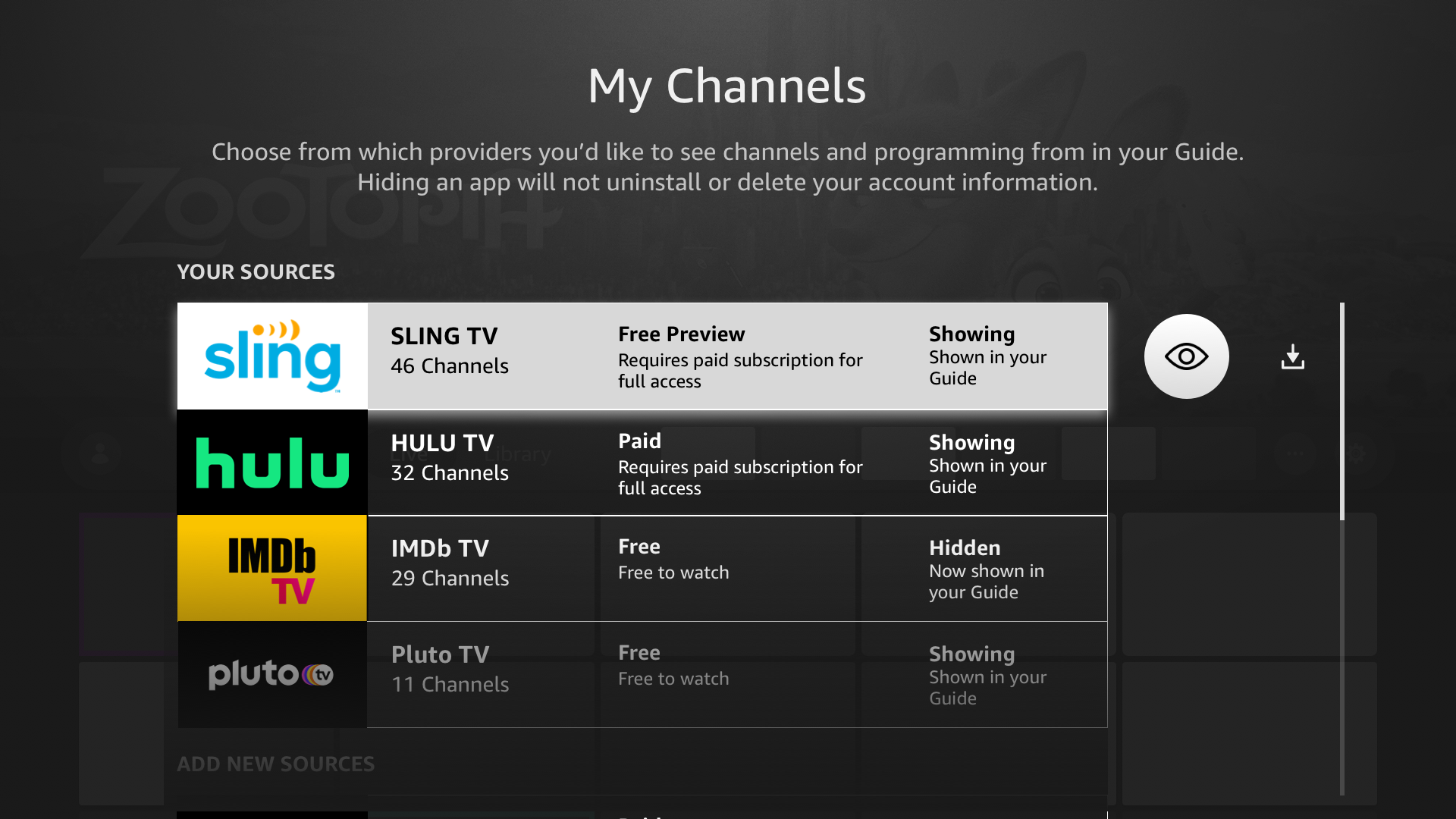
02
Subscription cards

01 | Entitled
A service that a user currently has showing in their guide lineup.
.

02 | Entitled
A service that a user currently has hidden.
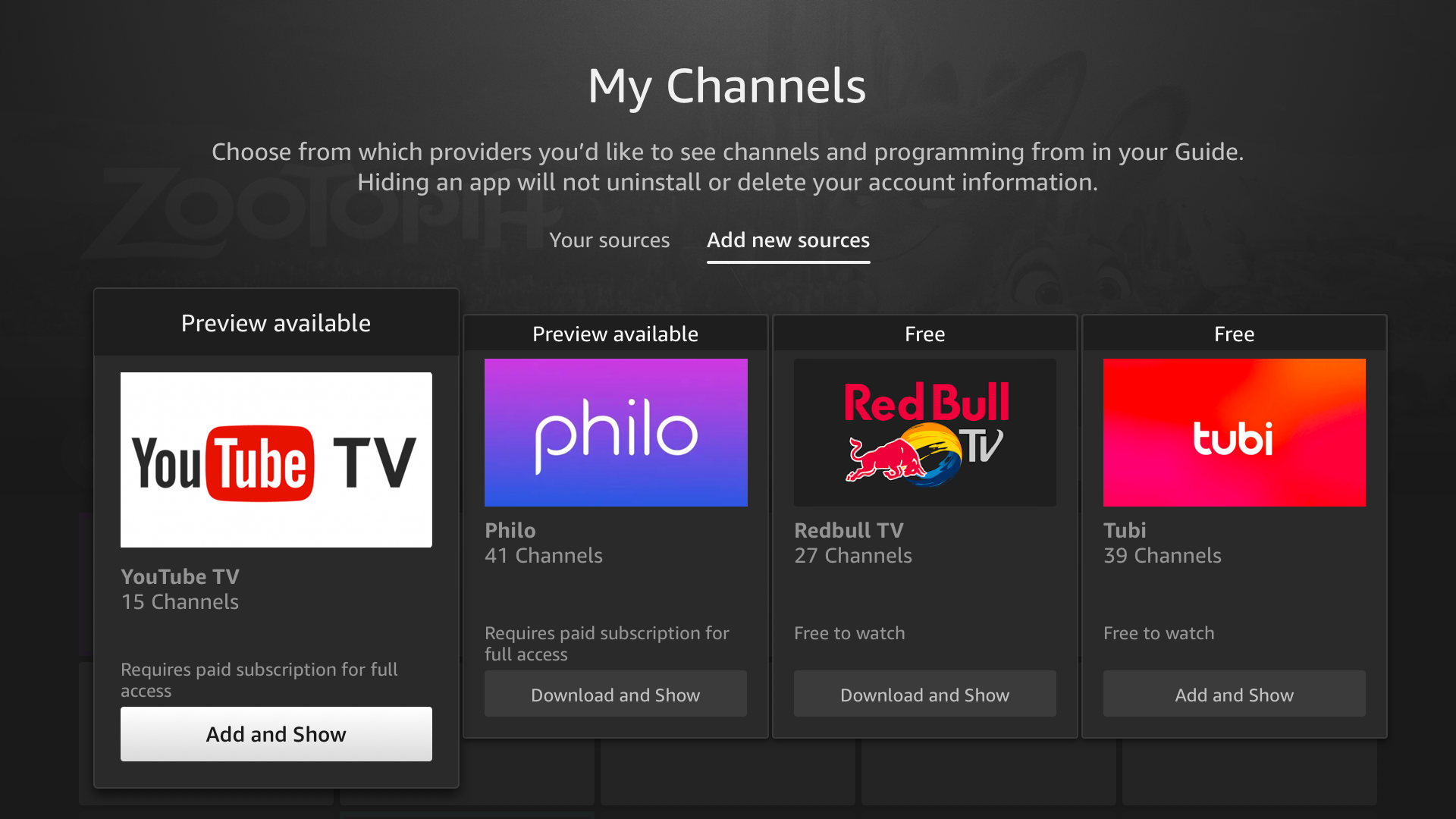
03 | Unentitled
To add a new source, the user navigates to the ‘Add new source’ tab. Here, is where a user can add a service that has a free preview that will be shown in the guide.

04 | Unentitled
A service with a free preview that doesn’t require a download that has been added to a user’s lineup.
03
List view + buttons
01 | Entitled
A service that is currently showing in the user’s guide as a free preview. The user can either choose to hide the preview they are seeing, or download the app and become subscribed.

02 | Entitled
A service that is currently hidden in the user’s guide, that is being used as a preview. The user can choose to unhide the preview, or download the service and become subscribed and fully entitled.

03 | Unentitled
Unentitled (or unadded) services are in a separate list that the user can add from. Since this service offers a free preview, the user can simply add it to their lineup without downloading or subscribing.

04 | Untitled
This service requires downloading before the user can view the free preview, so the only option is to download.
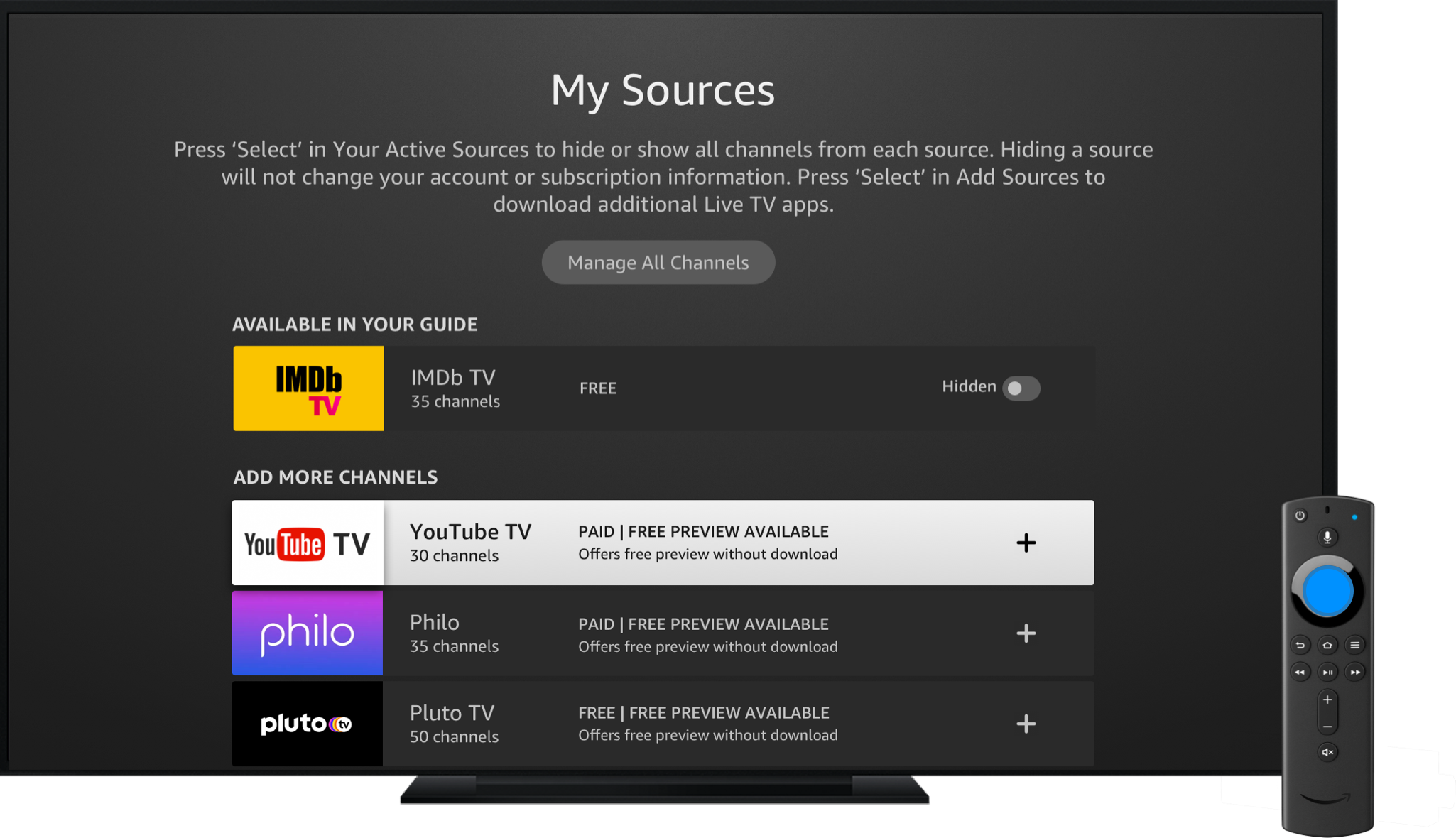
04
List view + toggles

01 | Entitled
Service is showing and populates the user’s guide with a preview of programming.

02 | Entitled
The service is hidden from the user’s guide.

03 | Unentitled
For a service that requires a download, the only option is to download the service. Other services have a toggle to quickly add a preview of the service to the user’s guide and lineup.
05
Active app row

01 | Entitled
All of the user’s active services live in the top fixed row.

03 | Unentitled
There is a separate section dedicated to services that offer a free preview without a download.

05 | Unentitled
For services that do not offer a free preview, they are in a separate section where the only option is to download and become subscribed to the content.

02 | Entitled
Active apps that are currently shown in the user’s guide will have an option in the context menu (invoked via remote menu) to hide the service. Hidden apps will be shown as hidden.

04 | Unentitled
The user can choose to add the service to their lineup without a download to see the programming preview, or go straight to downloading the service to subscribe.

06 | Unentitled
The only option for services that do not have a free preview is to download and subscribe.
Design feedback
-
Design should be scalable for multiple sources.
For some of these explorations, only a few services are in few at a time. Especially in the scenarios where a user may have multiple services, or where they want to browse all available services, it’s important to have as many sources in view as possible. This will avoid the number of clicks it takes for a user to find a service they may be looking for.
-
Feature purpose should be easy to understand at a glance.
A lot of comments were made around some of these explorations (especially the card treatments), that it was unclear what this feature exactly did at first glance. Because of the complexity of this feature and the robust functionality we are introducing, it’s important that the user can quickly figure out what this feature does, as well as learn how to use it with very little friction.
-
Use an interaction pattern users are already familiar with for a complex feature.
Some of the explorations seemed to be overcomplicating the main functions of this feature. Because the main functionality is allowing users to choose to show or hide all content from each service, we should be using an established pattern that users are already familiar with to do this action. Great examples of this are iOS toggles, light switches and other binary actions.
Final designs
After even more rounds of iteration and feedback, we landed on the experience for MLP. There were some sacrifices we had to make to simplify the experience, but ultimately I think we landed on a solution that is much simpler for the customer, while still giving them the opportunity to have control and autonomy over the Live content in their guide.
01 | Add a service
For a user to add a service, they focus on the service to add and press ‘Select’ on the remote.

02 | Preview modal
If there is a preview available, this modal will display where the user can dismiss it and see the programming preview in their lineup, or continue and proceed to download.

03 | No preview available
If there is no preview available, the user would ingress to the app download page when they choose to add a service.

04 | Added service
Once a service is added, it will move into the section titled ‘Available in your guide’, where the user will then be allowed to turn the content from that service on or off.
Key design decisions
01
Not all services will be treated the same, and that’s okay.
At the time of launching this experience, not all services will have the same level of integration. That means, only the integrated services will be able to offer a programming preview to users. However, to ship this experience sooner, that was a compromise we had to make.
02
Removing the option to download from the UI.
As I continued to iterate, I learned that a point of friction was having a dual CTA for services that could be added (download/add). We had to really fine tune our language and how we talked about it to make it understandable for users. So, the result was having an ‘Add’ icon be the only option for non-added services. Then, based on their level of integration, we’d either allow the user to proceed with the preview, or reroute them to the download page.
03
Adding supplementary copy to add clarity for users.
Because each service can be in multiple states (preview available without download, download required, free, paid, etc.), I thought adding an affordance for the details of each service would help users make more educated decisions about adding the service to their lineup, and how to become entitled to the service.
Outcome
Our only opportunity for testing will be upon launch.
Although the testing strategy was ambiguous throughout the design process, unfortunately there was no time or resources to usability test this experience. That means the first feedback we will receive from users will be upon launch. The hope is this will be a continuous and iterative workstream, and I can continue to improve this experience along with my project partners once we have a better idea as to how it’s being received by users.
We are continuing to integrate services into Live TV, so this feature will only become more valuable to users.
As Live TV expands on Fire TV, the hope is more services will become integrated and acquisition and engagement will increase. If that goal is successfully met, we predict users will rely on this feature even more to curate and personalize their lineup. This is * hopefully * the first step of many to help customers build and personalize a Live TV experience that is relevant and important to them.
Reflections
-
Layered functionality doesn't always equate to a good experience.
Because the requirements and goal of this feature had a lot of complexity, it ooks a lot of time and iteration to come to the conclusion that a super powerful feature doesn’t always make it a good experience for users. After spending lots of time simplifying and weeding out noise that just confused users, I landed on an experience that I feel like users will value and help enrich their Live TV experience.
-
User research is a luxury.
I’ve learned on this project just how tight the resources are for our research team. Sometimes, there is just no opportunity to fit in user research, so you have to work with what you have. I had to really practice leaning into the data that was available, to create the best experience possible with what I knew about our user. It can be scary to take a risk, but that has highlighted the importance that any launched experience is never perfect or done.
-
Balancing what's right for the user vs. the business can be tricky.
Early on in this project, I was really focused on providing detailed information about each service such as price, subscription information, etc. I learned quickly that although that is helpful for our 3P partners, it’s not putting the user first. It’s my job to let users know what’s available and have the ability to discover these services, but it’s ultimately up to the 3P partners to try and sell them.