
Nordstrom iOS SKU Selector Redesign
Lead UX Designer
Platform: iOS
Problem
Nordstrom offers a wide range of products, in many sizes and colors. However, product availability can vary by color and size, so customers are unable to see product availability until they select at least one sku (size/color). Because each sku selection requires a tap, customers have to tap back and forth to see availability based on color/size (sku), creating friction for customers to discover product inventory availability. Depending on inventory status of a product, a customer could select their sku, and then find out that specific sku is out of stock, forcing them to start over and re-select an in-stock sku. This causes a poor customer experience and possibility of disappointment for customers hoping to purchase a specific sku.
Existing Experience


Hypothesis
Allowing customers to see all sku options in the same place, with the ability to toggle through selections, will allow customers to see inventory availability sooner, and reduce the amount of taps to select the sku they would like to purchase. In turn, this should help increase conversion.
Existing Research
To get a better understanding of the existing research and the thought process behind the current sku selector design, I revisited past usability studies that informed the current design. A helpful study that one of our researchers conducted, was a study in which she showed participants sku selectors of other retailer competitors, and measured their qualitative feedback about what worked and what didn’t.
Below are some research takeaways:
Prevent location disruption
Customers preferred to stay on the same screen when making sku selections
Keep information above the fold
Users liked seeing all of their sku options above the fold, with the product image still in view
Make options discoverable
Scrolling (for color swatches) is discoverable if there is a peek of the next color
Dynamic product imagery
It is essential to see the main product image update as customers select various colors
Optimize the white space
Any white space above the product images should be removed to maximize the view of the image
Discovery
Before I dove into thinking about design, I wanted to gain an understanding of our baseline — where we are today. The questions I started with were:
What % of customers interact with our color dropdown vs. color swatches?
How many of our product offerings offer 5+ colors?
What % of our products have 3+ colors?
How many products are we incorrectly using the “color” sku for? i.e. What other product features/choices are we utilizing as the color sku?
After brainstorming some of these key questions, I was able to partner with our business and merchandising analytics partners to get some key pieces of data to help inform my approach with this project:

56.2%
of all products have 3+ colors
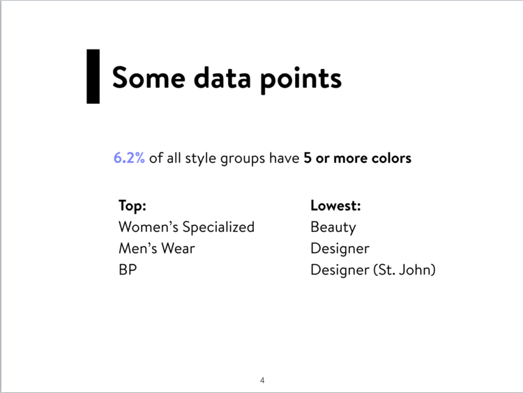
6.2%
of all products have 5+ colors

Color types
The color “sku” types vary across different types of products

Size types
The size “sku” types vary across different types of products
Conclusions from discovery
Ideally, we should design category-specific sku selectors
For the MVP experience, we should design a solution that will satisfy a majority of use cases, while making sure the edge cases are not broken
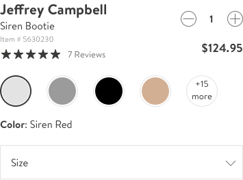
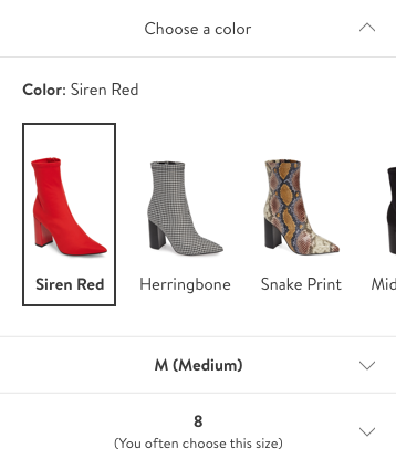
Competitive Audit
Once I understood the data around our current product skus, and what gaps there are exist in our current design, I spent some time conducting an audit of our competitors to understand how they are handling similar challenges Nordstrom faces around skus. For example:
How are they handling sku selectors for products with different size attributes?
How are they handling sku selectors for products with different color attributes?
Competitors


Audit takeaways
2/10 competitors had a SKU ‘drawer’
4/10 competitors had some sort of inventory or urgency messaging
Some competitors had inconsistent “swatches”
Important to surface sku information at a search/browse/nav level
Important to have consistent sku treatments (of size and color)
Most products have <5 colors available, besides beauty items
Problem Statements
-
01
Today’s swatch sizes are much more touch-friendly than in the past, however, the existing swatches can be difficult for users to see various colors, patterns, and textures from the swatches themselves and while the color dropdown is open.
-
02
If our users are shopping for beauty products that have many different color options (like lipsticks), it can be difficult for customers to see the subtle differences in colors. (i.e. are we surfacing colors of beauty products to our customers in the best way?)
-
03
Today, we are only able to display options for color, size and width. If an item has other options available, we use these options as a workaround to display those additional options.
-
04
Today, size/color combination availability requires multiple clicks to see options.
Initial Explorations
Product page entry points
Before I explored what the actual SKU selector experience could be like, I explored different entry points on the product page to this experience. In today’s current state, we have scrollable swatches and dropdowns on the page. Below are a view variations of the potential new entry points I explored:

CTA ingress
Swatch-style ingress

Text ingress
Drawer selection states
Because one of the goals of the SKU selector redesign was to have all options available in the customer’s view at once, as well as have the ability to convey inventory availability more clearly, I explored what different selection states would look like in a drawer. I made sure to explore what selection states would look like for SKU level types, as seen below:

Color/pattern swatches

Product image with color
Product image with combined name
Numeric size selectors
Design feedback
Although these are just a few of many explorations that I shared with my design team, I received very valuable feedback that I was able to incorporate into my next iterations. Some high level points of feedback were:
01
How can we have a consistent selection state across all different SKU levels? (like size, color, width, initials, volume, etc.)
02
Think about the order of SKU levels (Which SKU would customers want to select first? Which SKU levels have the largest inventory implications?
03
How could we communicate inventory levels or urgency messaging in this new design?
04
What improvements can we make that are category-specific?
05
How can we incorporate critical product information that might impact SKU-selection - like the pre-existing fit tip?
Next iterations
Based on the feedback from my design team, I thought about some of these questions and pieces of feedback a little more deeply. I explored selection states that felt on brand with Nordstrom, explored how to communicate inventory levels in a clear, noticeable way, all while being mindful of screen space, as well as explored what these treatments would look like across categories.

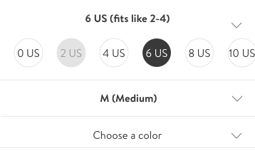
sku selector | shoe
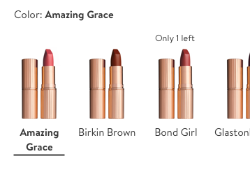
sku selector | beauty item | product image
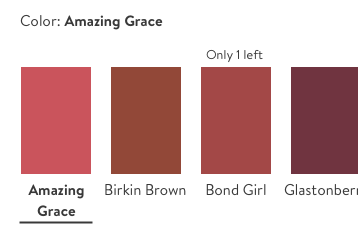
sku selector | beauty item | swatch

sku selector | candle
Design feedback
After showing these variations to my design team, I received more great feedback to help shape the designs that we would like to test in a usability test. Some of the key pieces of feedback were:
01
Try incorporating the product price in the drawer - in some cases, price can vary based on SKU selection and research has showed this is critical information to the customer
02
Separate out customer choices (like color selection, size selection, etc.)
03
Make customer selections prominent
04
Add an exit point for customers in the drawer itself - make it clear to customers their selections will be saved when returning to the product page
Designs for usability
-
-

01 | Shoe product
We wanted to test a product that has multiple sku levels, creating a number of variables that would affect the item’s availability — such as color, size and width.
-

02 | Beauty item
We also wanted to test how this design might work for a beauty item, where there can be a up to 50 different colors and long sku color names.
-
Usability test prototype
Because we are testing two versions of the SKU selector drawer — one for beauty and one for shoes, there were specific questions we wanted to know. Some of these questions were:
01 | Shoe prototype
02 | Beauty prototype

Customer questions:
Do customers notice the “fit tip”?
Are the product thumbnails big enough/can the customer see the colors clearly?
Do customers notice the price?
Do customers know what to do once they make a selection?
Customer questions:
Are swatches of the color themselves more helpful than a product image?
Do customers clearly see the updated color as they scroll through color options?
Do customers understand how the swatches are ordered?
Do customers notice the price?
Do customers know what to do once they make a selection?
Research findings
One of our UX researchers ran a remote study with 18 participants, who have not made a mobile purchase in the past 18 months (to avoid bias for the current design). From that study, there were a few main areas for improvement that was highlighted:
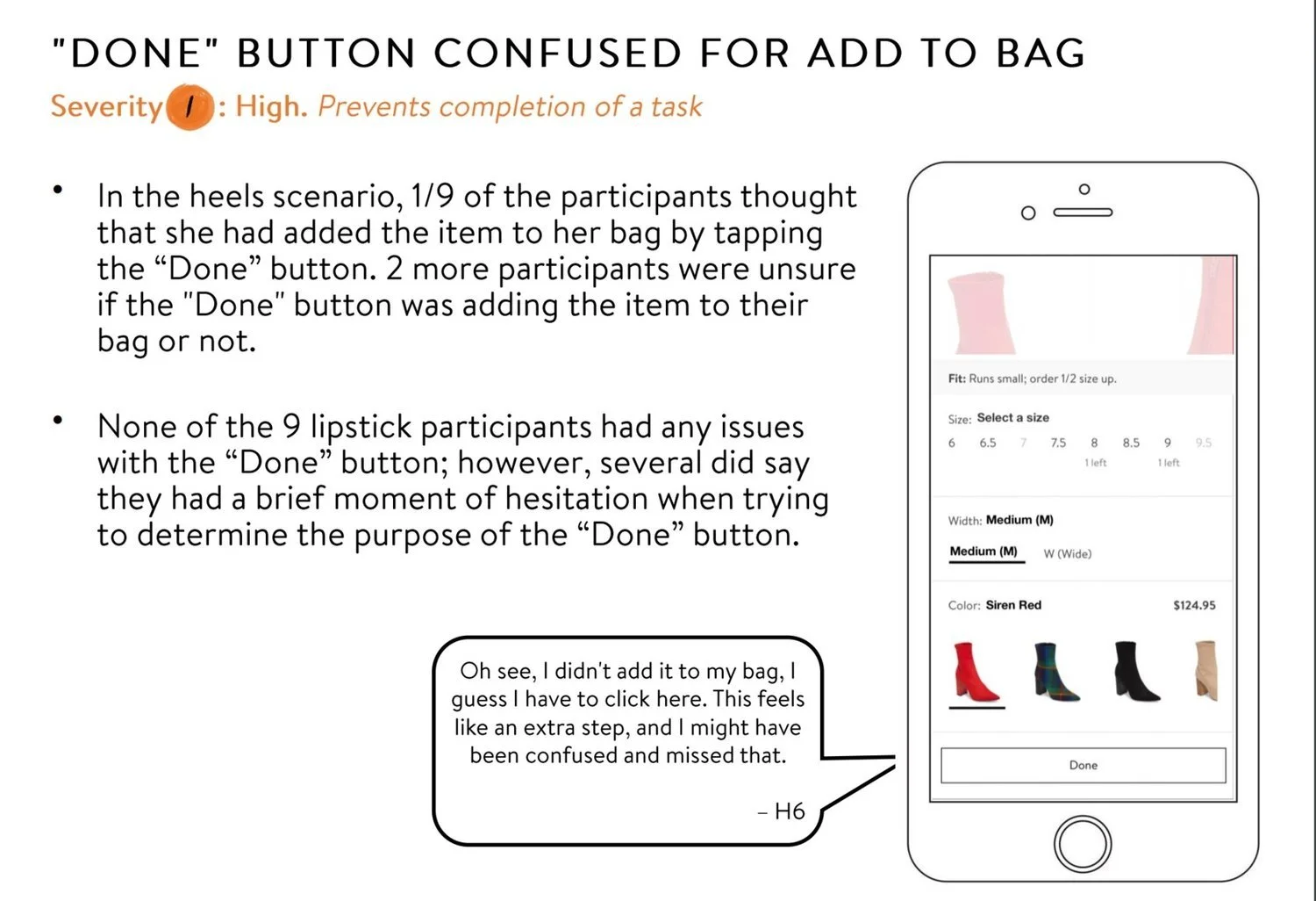
”Done” CTA was confusing
It was unclear whether tapping “Done” would add the selected product to bag with the selected SKU
Unsure whether selection would be saved if customer did not tap “Done”
Research recommendations
Change copy on CTA to be more explicit: for example, having the CTA say “Select” or “Save”
Consider adding an “Add to Bag” button to the drawer
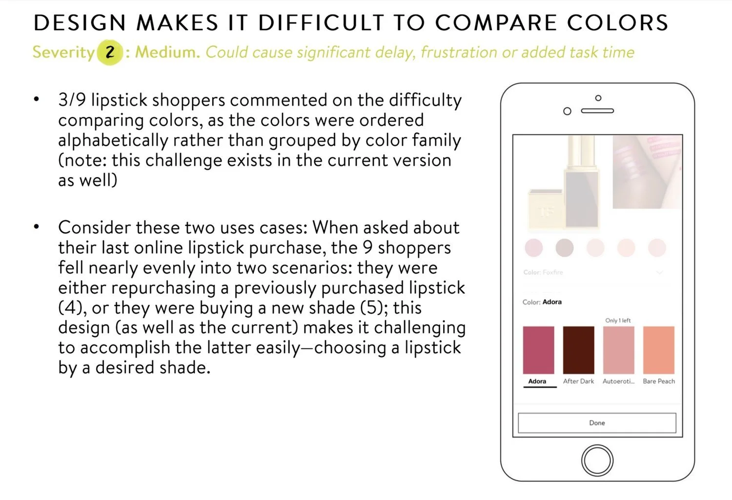
Hard to compare colors for products with a variety of colors/shades
Because only ~4 colors were shown on the screen at a time, it was hard to compare colors for a product like lipstick, where each buying decision heavily relies on color/shade confidence
Make design flexible enough for the shopping scenarios of A) repurchasing and B) discovering and purchasing a new shade (existing design makes difficult as well)
Research recommendations
Consider different ways to group colors (as by shade/hue instead of alphabetical name) to help promote comparability and discoverability of shades
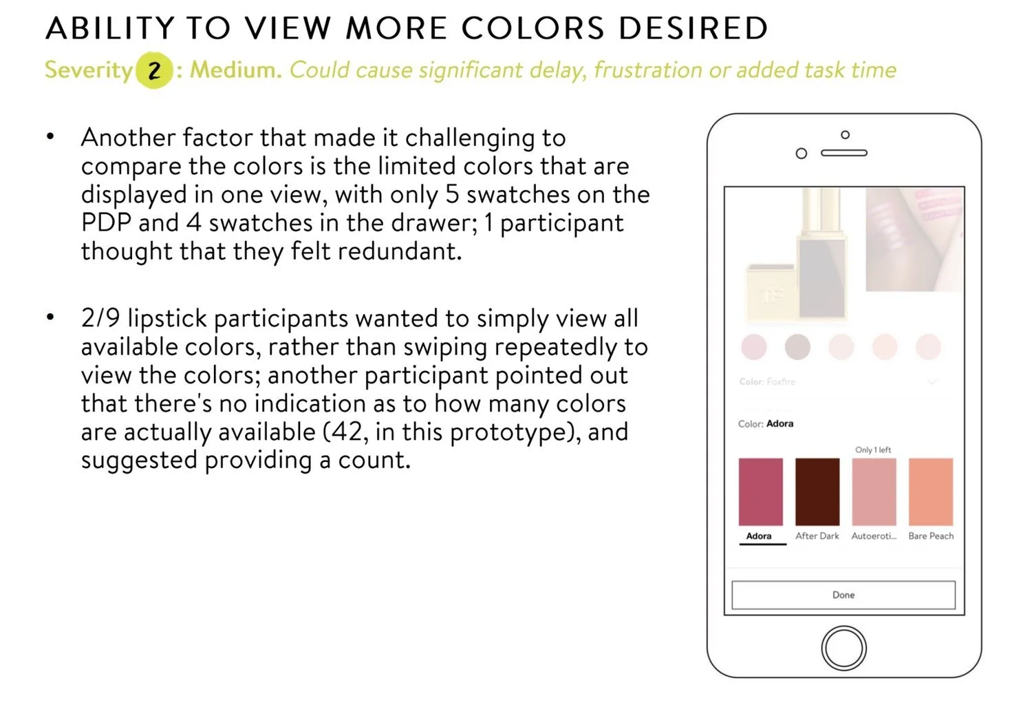
Customers want to see more colors at once
Customers would like to see all available colors at once, instead of having to swipe multiple times to see all colors
There is no indication as to how many colors are available for this specific product, making customers having to guess at assortment
Feels redundant to only show 4 swatches at a time in the drawer, when the product page surfaces more
Research recommendations
Consider different design treatments for specific product categories — like lipstick, showing more shades in the viewport at once to help support color comparison and discoverability
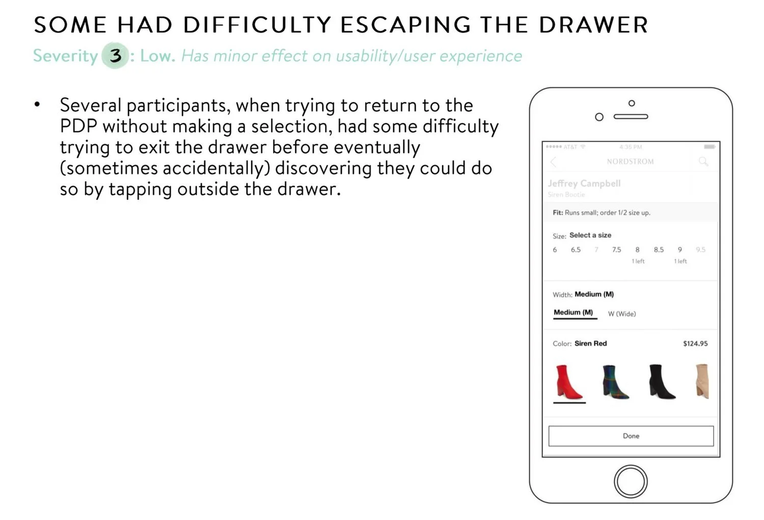
Need a clearer exit point in the drawer
Was not clear to users how to exit the drawer without tapping “Done”
Customers were confused how to exit if they did not make a selection
Research recommendations
Consider adding a clear exit pattern to the drawer that is intuitive for users
Play with the visual treatment of the drawer to make exiting clear to the user
Final designs
After taking all of research’s recommendations into consideration and focusing on the problem areas identified by research, many feedback sessions from the design team, I landed on a final design that is intended to be built and A/B tested on the Nordstrom iOS app.:


Key design decisions
01
Did not change the product page entry point for the drawer for the sake of tech debt for the test; as well as wanting to isolate the drawer for measurement
02
Adding an ‘X’ exit icon to help customers exit the drawer
03
Updated the CTA to a primary black and changed the copy to “Apply” - which is more clear in communicating saved selections
04
Added instructional copy at the top of the drawer to guide customers in what to do
05
Did not add color swatches for beauty items due to current internal product setup limitations
06
Did not add more color swatches/product images for beauty items because for the initial A/B test, we need a general treatment before implementing category-specific SKU selector treatments
Reflections