
Project Euclid
Lead UX Designer
Platform: Fire TV OS
Background
Role
Lead UX Designer
Partnered with Principal Product Manager to lead project strategy
Timeline
November 2023 – May 2024
Stakeholders
Product Management
Research
Visual design
Prime Video UXD
Engineering
Customer problem
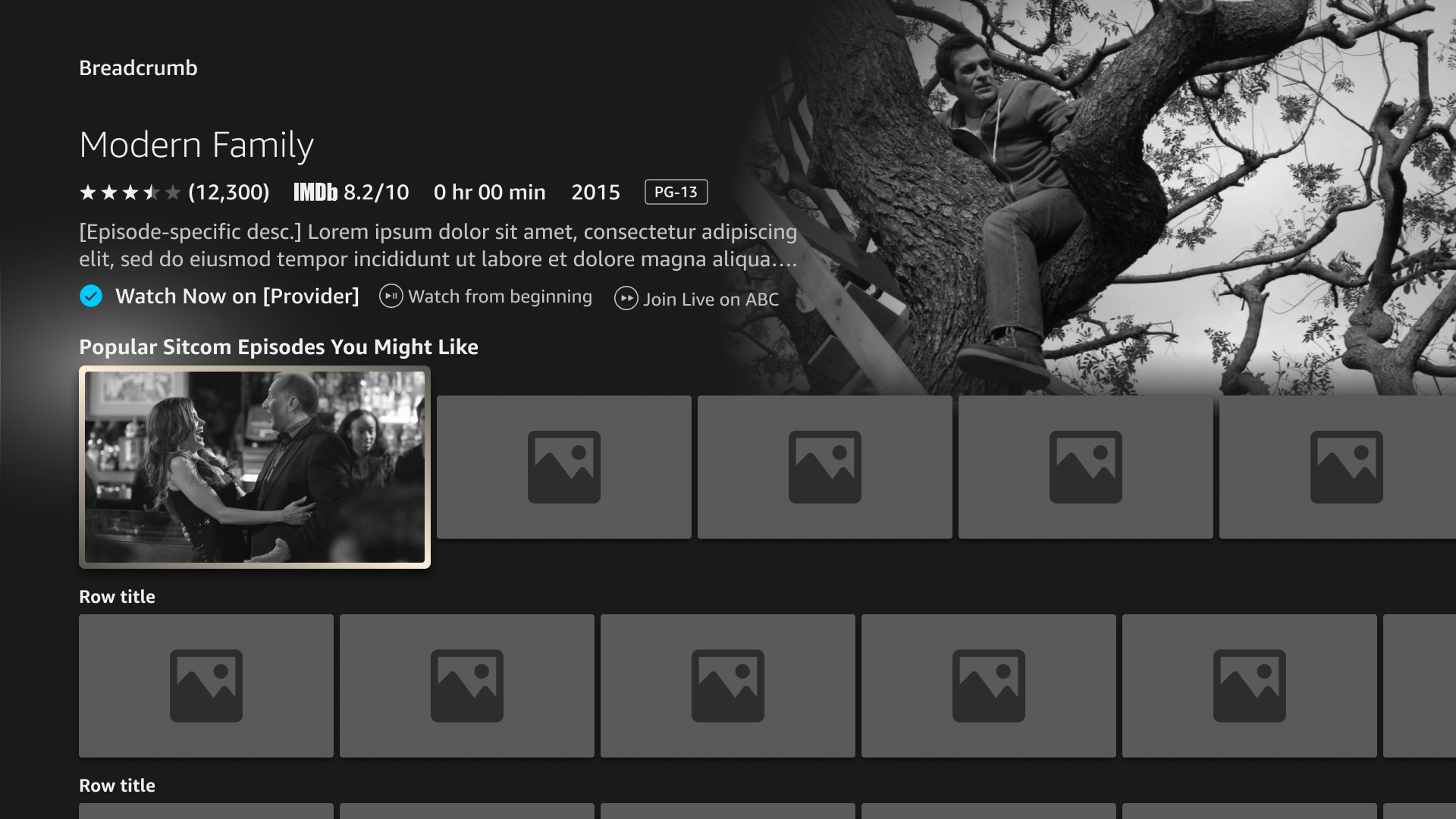
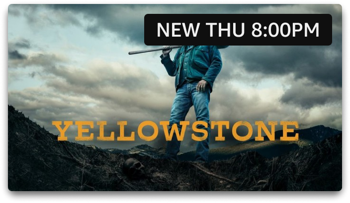
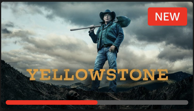
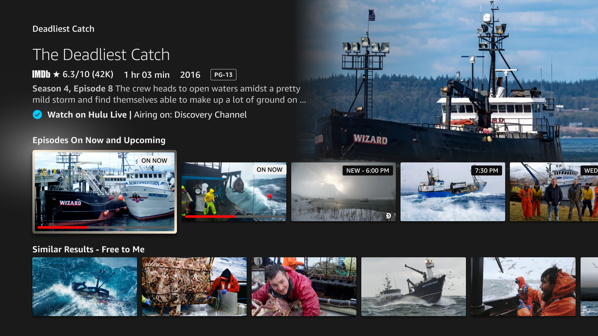
In the current Fire TV experience, Live TV content is isolated to its own tab in Navigation, and no Live TV content is discoverable in the Search or Browse experience.
The goal of Project Euclid is to integrate Live TV content across the FTV experience, and make it just as discoverable and consumable to customers as VOD content (video-on-demand).
Existing CX

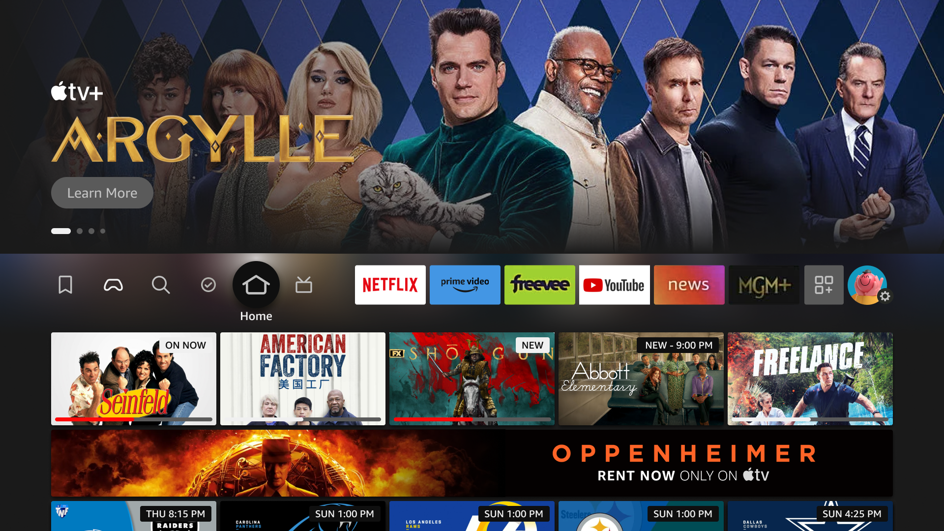
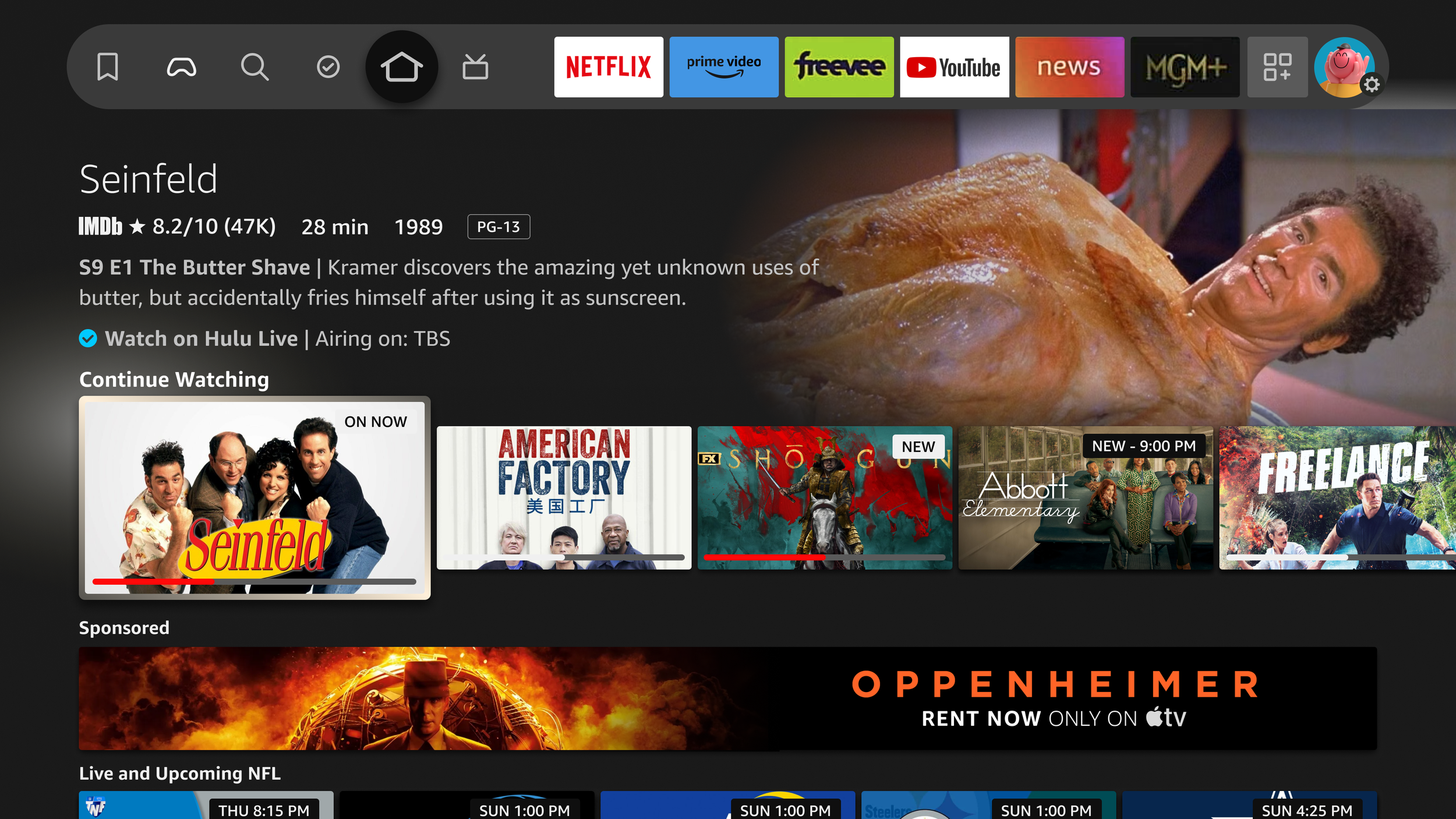
Home
No Live content recommendations

Live Tab
All Live content is isolated to the Live tab, and is not discoverable
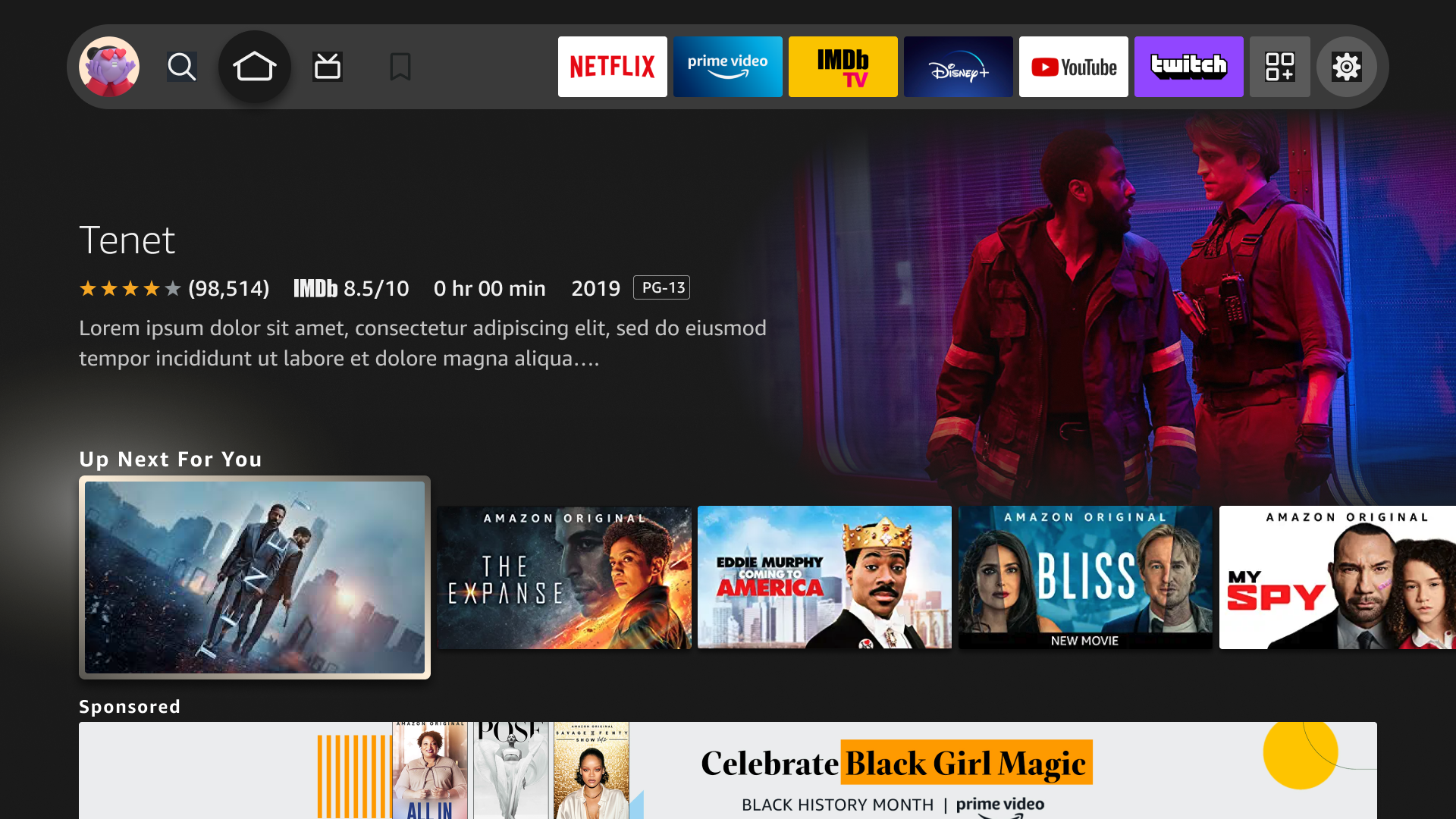
Home – Browse
No Live content within recommendation rows

Search
No Live content included in Search results even if there are relevant Live results available
Existing research
Based on a customer insights’ survey, these were the results from customers when asked specific questions about finding and evaluating Live content on Fire TV.
43% Very good
13% Not good enough
When I have some criteria in mind to watch (e.g., something funny, baseball, etc.), Fire TV helps me narrow down my options across the services I care about.
33% Very good
11% Not good enough
When I don't have anything in mind, Fire TV helps me discover relevant content sourced from across the services I care about, including linear content.
31% Very good
27% Not good enough
I can easily compare VOD and Linear shows to make a selection on what to watch.
Research takeaways
Searching for Live content needs to be easier
We need to make Live content more discoverable for customers when they don’t know what to watch
We need to surface both options to either start over from the beginning (VOD) or watch on Live TV when both options exist
Discovery – Defining content & customer journey
I started the process by zooming out and starting with the foundational blocks that currently comprise Live TV: the content types and definitions. I led a workshop with product and engineering to align on these definitions and the basic user journey a customer has when watching Live content on Fire TV.
Content Definitions
VOD
Video-on-Demand; content you can start watching from the beginning at any time (ex. Netflix)
Live-Linear
Content that is being played on a linear timeline (on a channel), and is typically VOD content
New
Content that has never aired before. This is a one-time state
Truly Live
Content that is being aired that is also happening in real time (ex. NBA basketball game)
Live Events
Content that has never aired before (is new), is happening in real time and is not available on VOD)
Customer Journey
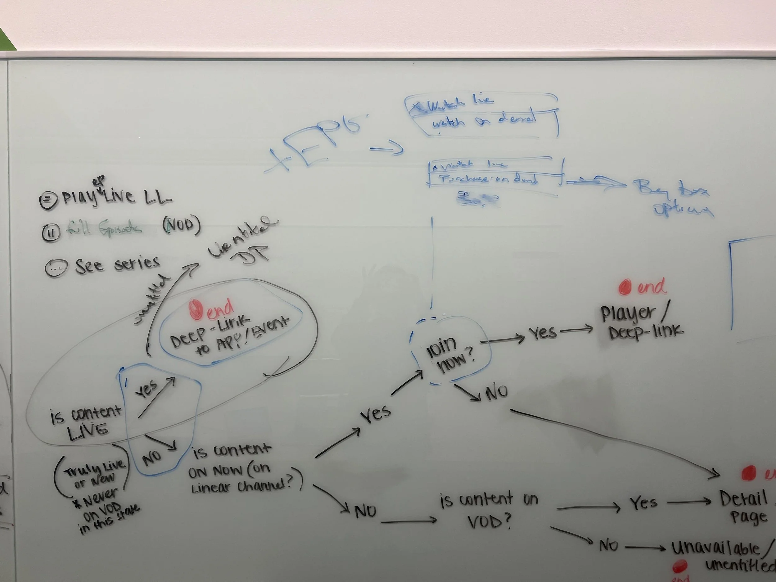
Flow created at UX + Product + Eng brainstorm

Digitized flow
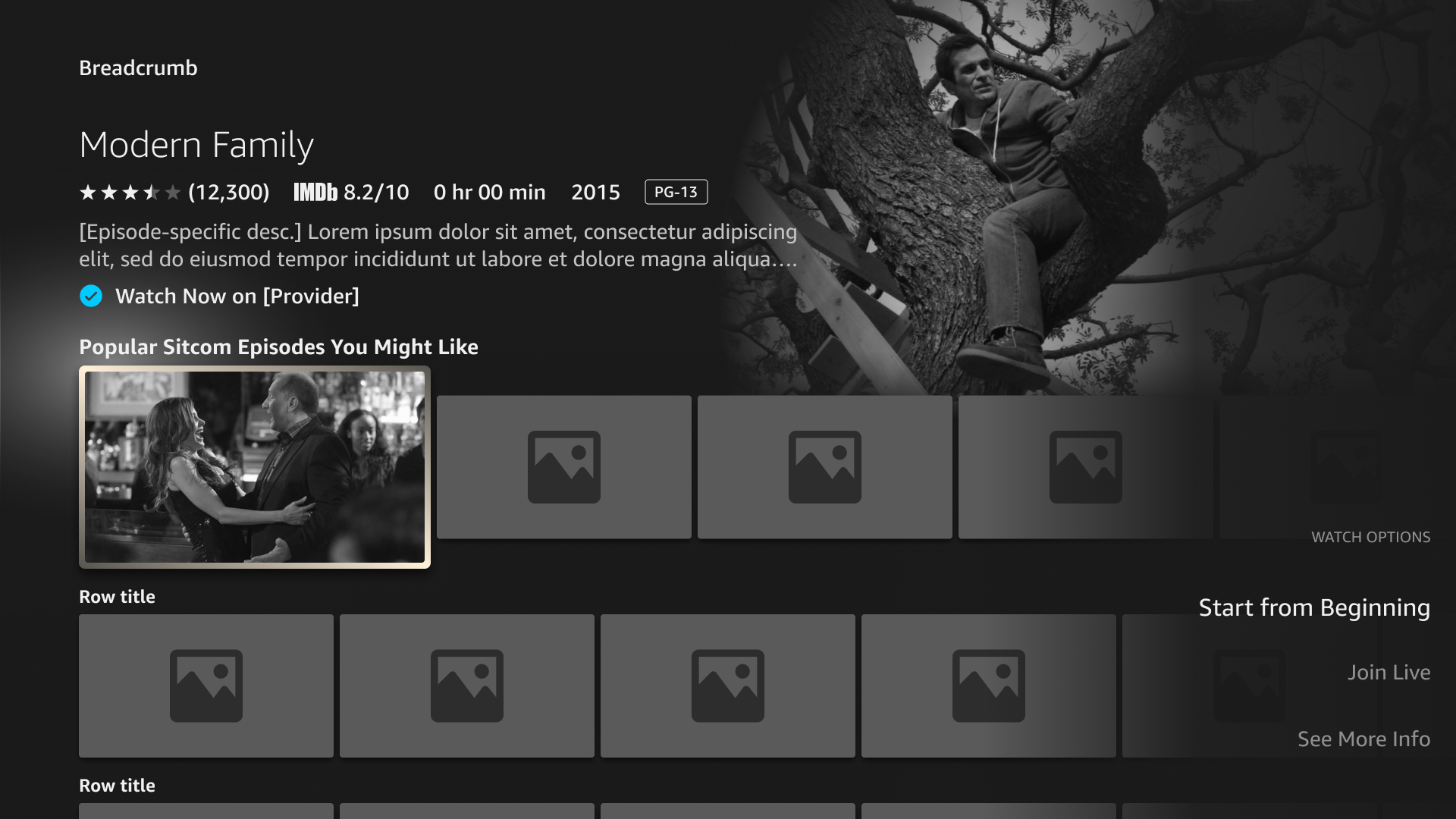
Proposed Foundations Changes to Fire TV
After a lot of debate and collaborating among my product and engineering parters, we landed on four key foundational changes to the overall FTV experience:
Ability to bypass content detail page from Browse
Ability to join a Live-Linear airing from Browse directly (skipping over detail page)
Surface both VOD & LL watch options from Browse
Show both ways to watch and leverage a remote shortcut for watch options
Display offers for Live & VOD on content detail pages
Show all offers for a piece of content, including any current or upcoming Live airings
Introduce a clarified
badging system
Create a new system of badges that accurately and intuitively communicate Live content type and state
Defined Success Metrics
% Conversion of Live content
Time-in-content
% of Catalog integration
Tenets
When we realized the impact of this project and how it scaled across the entire FTV experience, the immediate working team spent some time establishing tenets to help our work progress when we encounter difficult decisions.
Bias towards VOD when deciding between on-demand and Live Linear.
When content is available in multiple content types (LL vs. VOD), lean on serving customers the type that gives them the most flexibility to watch at any point. *assuming entitlement. Logic: entitled VOD > entitled LL > unentitled VOD > unentitled LL
Consolidate repetitive content.
When repetitive airings of Live Linear on different providers have the same channel, content (such as episode) and airtime, we will collapse the multiple tiles into a singular content tile. We don’t want redundant LL content to take up valuable real estate for customers and cause confusion by surfacing redundant content.
Surface Live Linear (LL) content when it contextually makes sense.
VOD empowers customers to discover new content and watch on their terms. Show LL content throughout the CX when customers are looking for it - don’t clutter their Home/Browse with LL unless we know it is relevant.
Always provide a choice, but reduce friction wherever possible.
Allow customers’ to be in the driving seat of their watch experience – allow them to choose their path by surfacing their options in a clear and intuitive way.
One size does not fit all.
Create experiences for our customers that are dynamic and smart – use the data and anecdotes we have about customers to serve them options and features that are intuitive for the mindset they are in. For example, we can change when to prioritize VOD over LL and that’s okay, so long as it makes sense to the customer.
Design Explorations
Browse Ideas

Episode content tile in browse
Metadata shows individual episode in-progress on channel
Ingress to join directly Live or to start from beginning (VOD)

Series content tile in browse
Metadata shows series-level info
Ingress to join an episode directly Live or to go to detail page to select specific episode
Browse – Wireframes

Series Search Results
If user searches a generic series, they will receive a primary result of the series, followed by a Live-dedicated row of any currently airing or upcoming episodes of the series
There will be a remote ingress to enter directly into an airing episode of the series (if it exists, otherwise there is no shortcut)

Specific Episode Search Results
If user searches a specific episode of a series, the primary results will include the specific episode (VOD version as well as a Live version, if airing) and an ingress to the series
There will be be no remote ingress on the Live-specific tile because the primary action already deeplinks to directly to playback
Detail Page – Merged Offers

Detail Page with combined offers
Detail Page with VOD & Live Watch Options
Live-specific offers will have a visual affordance to represent it’s a currently-airing offer (ex. YouTube TV)
We will also surface a recommendation row dedicated to current and upcoming airings of episodes
Converging all offer types (VOD & Live) creates a central destination that surfaces all ways to watch
Concept Feedback
After aligning on this early concept with product, tech and UX, we shared it across multiple internal leadership and teams for feedback:
Pros
Remote shortcut allows for dynamic watch options
Live-linear content is definitely more discoverable
Surfacing On-Now and Upcoming Live content is helpful in communicating state of content
Driving users to Live content more quickly by allowing them to skip the Detail Page
Aligned with introducing tiles that are series-level and episode-level to make actions contextual
Cons
Introducing more robust remote functionality might confuse customers/force new behavior pattern
How do we differentiate an episode cover art from the series? How can we make the distinction clear?
We may need a different affordance to call out offers that are currently airing vs. VOD
‘Finer Details’ Explorations
Because the impact of this project spanned across the entire device experience, there were more pieces to the puzzle that needed to be sorted out. With the collaboration of UX, engineering and tech, we established that we needed a direction for these additional facets of the new vision of Live:
Badging System
We need a defined badging system that is glance-able, intuitive, and easy to understand.
Tile Art
We learned from tech that episode-level artwork is not always available, which forces tiles to display series art when representing an episode. This poses the question if extra metadata is needed.
Remote Shortcut Interactions
We had split perspectives on which affordance is best for a shortcut.
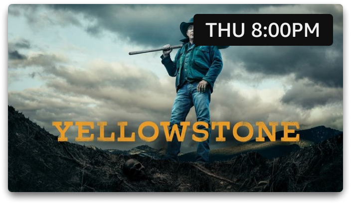
Badging System Explorations

Initial badging exploration inspired by Prime Video’s badging system
Highlights
Reserving red badges for truly live content only
“On Now” means live-linear content that is airing (VOD)
“Upcoming” means content that is not yet playing and badge color will define if it’s truly Live or not
VOD content will have no badges
Should align with Prime Video badging system
Tile Art Explorations
Due to complexities caused by Fire TV’s existing browse patterns, I had to explore how to ensure that the correct Live metadata is being surfaced (badge and progress bar), along with additional metadata when the tile cover art may not be clear.
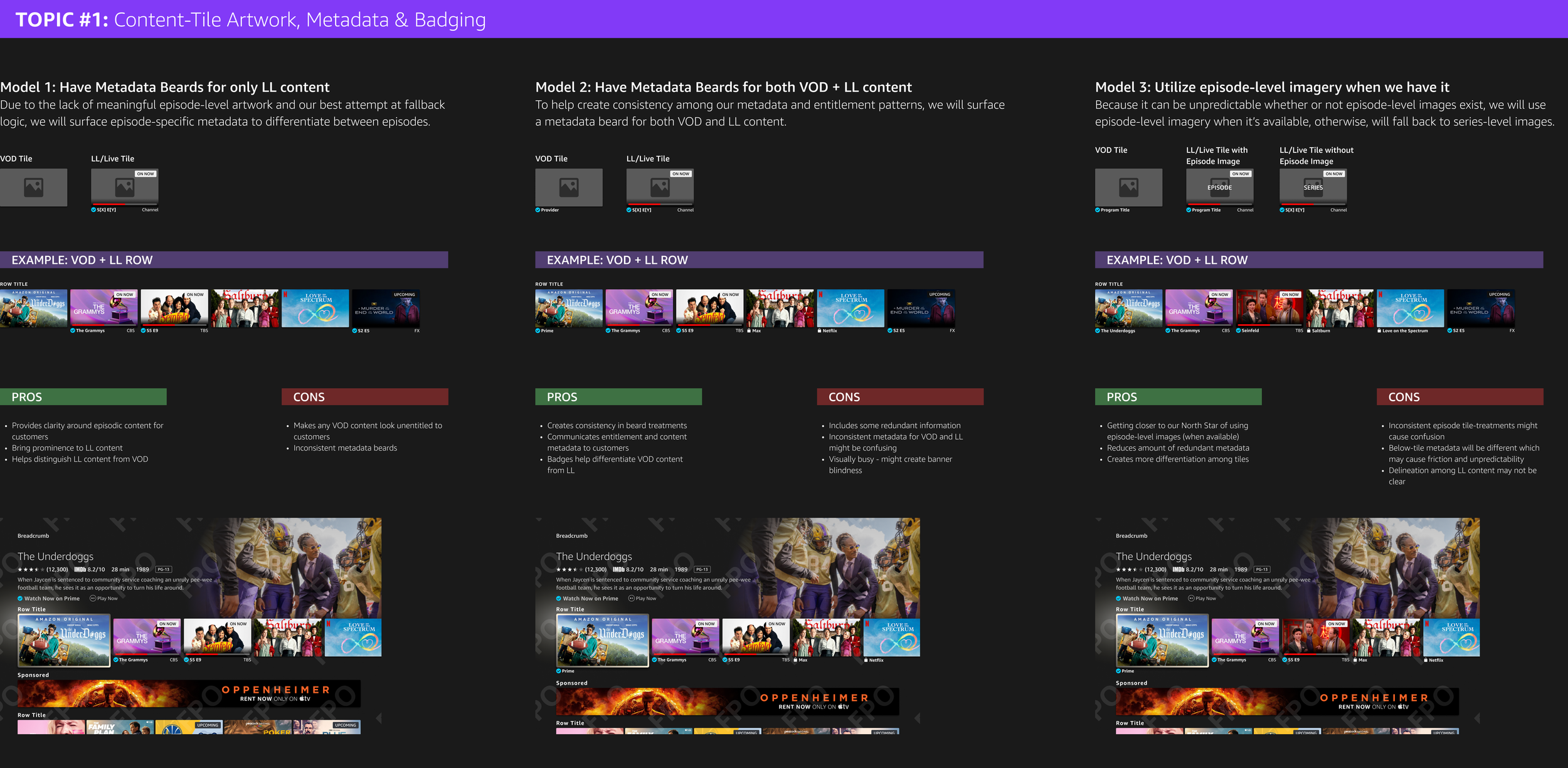
Model 1
Surface metadata only below Live tiles

Pros
Provides clarity around episodic content for customers
Bring prominence to LL content
Helps distinguish LL content from VOD
Cons
Makes any VOD content look unentitled to customers
Inconsistent metadata beards
Model 2
Show below-tile metadata for Live & VOD tiles (all tiles)

Pros
Creates consistency in beard treatments
Communicates entitlement and content metadata to customers
Badges help differentiate VOD content from LL
Cons
Includes some redundant information
Inconsistent metadata for VOD and LL might be confusing
Visually busy - might create banner blindness
Model 3
Utilize episode-imagery when we have it, but still badge all tiles
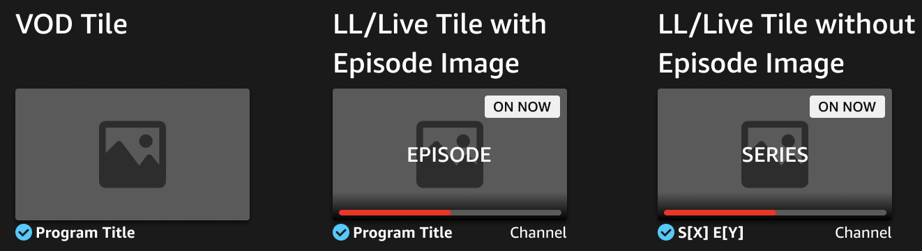
Pros
Getting closer to our North Star of using episode-level images (when available)
Reduces amount of redundant metadata
Creates more differentiation among tiles
Cons
Inconsistent episode tile-treatments might cause confusion
Below-tile metadata will be different which may cause friction and unpredictability
Delineation among LL content may not be clear
Remote Shortcut Interaction Models

Model A: Leveraging ‘PLAY’ for Primary Action Shortcut

1A: Live-facing content
Select: Content detail page
Primary action: Join Live
Secondary action: Start from beginning
1B: VOD-facing content
Select: Content detail page
Primary action: Start from beginning
Secondary action (if applicable): Join Live

1C: Series tiles
Select: Content detail page
Primary action: Ingress to detail page
Secondary action: If an episode of [series] is airing, Join Live

Model B: Leveraging ‘Options’ Button Side Panel to Surface All Options

2A: Live-facing content
Select: Content detail page
Side panel options:
Join Live (when applicable)
Start from beginning
Content detail page
2B: VOD-facing content
Select: Content detail page
Side panel options
Start from beginning
Join Live (when applicable)
Content detail page
Usability Research
Goals
Tasks
Get general feedback from users on our proposed strategy
Learn if the Live content is discoverable in Browse
Learn if users understand the differences between VOD and Live content and can identify each content type in the FTV experience
Learn if users can easily understand the Live badging
You'd like to find something currently airing to watch.
You'd like to watch Seinfeld but you want to browse the seasons and episodes to pick one to watch.
Screens

Home & Browse
Live, New, Upcoming & On Now badges
Removed remote shortcut
How to display upcoming badges: Option 1
Do users understand that this episode is upcoming?
How to display an on-now ‘new’ episode: Option 1
Do users understand that in this instance ‘Live’ just means ‘on right now' or ‘currently airing’?
How to display upcoming badges: Option 2
Do users understand this is an upcoming episode as well as a first-run and new episode?
How to display an on-now ‘new’ episode: Option 2
Does ‘New’ in conjunction with the color red make sense to users that it’s a new episode airing for the first time?
Research Learnings
7/10 users didn’t understand the difference between ‘On Now’, ‘Live’ and ‘New’ content
When explained, 50% of the users preferred using the ‘New’ badge with ‘Live’, while the remaining users thought ‘New’ should be grouped into ‘Live’
UXR recommended simplifying badging where it makes sense to avoid customer confusion. They recommended pairing down the number of badges we show to customers.
Final designs
After many rounds of leadership reviews and iterations, we aligned on a MVP CX to launch. We were required to simplify some of the ideas we had, however, made sure that whatever CX we prioritized, it was scalable and allowed testing into some of the future concepts we had previously explored and proposed.
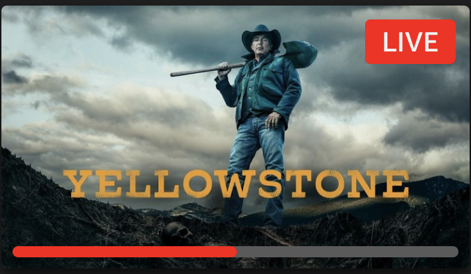
Badging

Final design decisions for badging
Align badging system with Prime Video
Aligned positioning, colors and copy
If deviating, make it intentional and intuitive
Because Prime Video shows on-tile metadata, we decided to put upcoming info in badge since FTV does not support on-tile text
Use red progress to indicate any content airing now
Because FTV has a lot more linear content, we wanted to reinforce that red = Live
Final Browse & Detail Page Strategy
Home Page
Browse
Removed all remote shortcuts for MLP due to scoping constraints. (Appetite to further explore this concept)
Simplifying browse tile ingresses
Main ingress will be contextual to tile
Ex. Live tile → Player; VOD tile → Detail Page

Search Results | Series
Prioritize showing series result
Follow with a Live-dedicated row of On Now and Upcoming episodes
Search Results | Episodes
Episode specific-tiles will display episode-level metadata such as description, time and channel
Episodes will be ordered in chronological order of air time and date

Detail Page
Created a separate offer section if the content is currently airing
Includes time left data so customers know value of current airing
Simplified affordance of On Now offer
Next Steps
01
Continue to test and optimize badging.
We got some helpful initial feedback in our usability testing, but we plan to carefully monitor our metrics and customer feedback and iterate as needed.
02
Engineering to investigate cover art optimization.
This project helped uncover a significant dependency for episode-level cover art – we rely 100% on 3Ps to provide us with imagery. Eng plans to look into ML and AI solutions to streamline the imagery sourcing and creation.
03
Internal beta launching with customers until October.
Because of the priority of this project, we didn’t do as much usability testing as would have been preferred. Before the CX is launched to customers, we are running an internal Beta to receive any critical feedback needed before launch.
Reflections
-
There is usually a lot more complexity than meets the eye when given an “obvious” or “straightforward” task.
This project started with an extremely ambiguous task, and it took a lot of questioning and investigating to uncover the areas that really needed debate and deeper thought.
-
Ultimately, there is never a “perfect” UX.
We were able to conduct some usability, but ultimately had to e comfortable launching this experience with unknowns. We know there is no “perfect” experience, so it’s best to proceed with an aligned and well thought-through hypothesis of what we think is best for customers, and be open to quick change and feedback.
-
When unsure where to start, get back to basics.
Because this was a project that was easy to dive head-first in, I wanted to start higher-level, and make sure we were considering the very foundations of the current experience. Once we started defining the type of content that exists, we realized a path was being formed of how to best share this content with our customers.