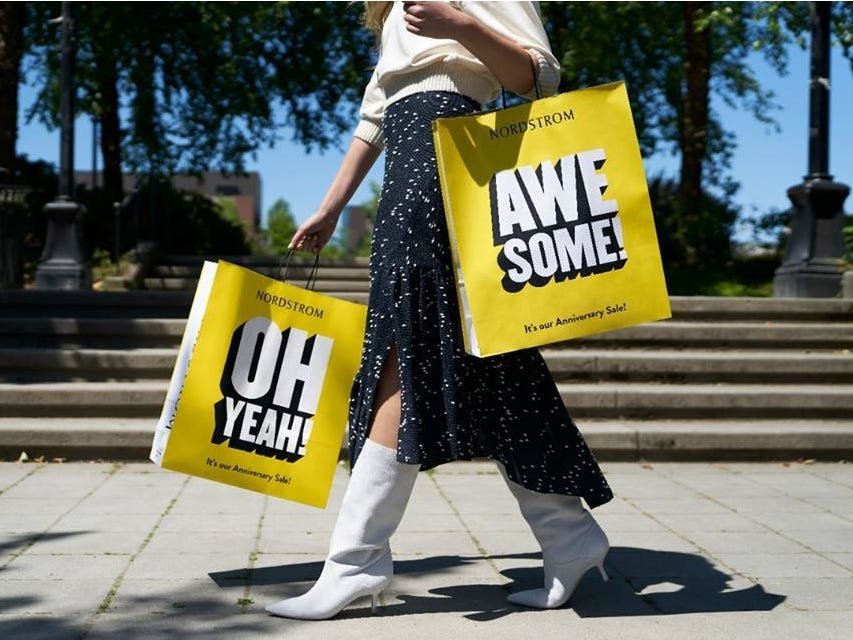
Nordstrom Loyalty Program Redesign: The Nordy Club
Role: UX Designer
Platform: iOS
Problem
The Nordstrom Rewards program launched in 2000, and through its 18 year life, we have identified many areas of opportunity to improve upon the program and provide more value to our customers. Therefore, Nordstrom has decided to invest in revamping and relaunching a new and improved Rewards program: The Nordy Club.
We have received consistent feedback from customers over the years that they do not understand the benefits of the program and do not think the program provides much value to them.
Important lingo
-
"Tender-neutral"
Customers enrolled in Rewards through just their mobile number (do not have a Nordstrom credit card)
-
Nordstrom Note
$X amount customers earn through shopping at Nordstrom and being a Rewards member
-
"Faster Rewards"
A new feature allowing customers to exchange points for smaller increments of Notes
Current experience

The prior Loyalty experience had a number of areas of opportunity for improvement that had existed for a long time. The Loyalty program was initially created to reward Nordstrom’s long-term and loyal customers, while enticing a new demographic of younger customers to shop.
Some of the high-level gaps that were recognized were:
No sense of excitement
Especially for customers who have a high level of spend, this experience didn’t seem rewarding or special.
No brand perspective
Although historically, Nordstrom has had a consistent and minimal brand approach, the Loyalty program didn’t match constant evolution of Nordstrom’s brand partnerships and product expansion.
Confusing points system visualization
A rewards hub should be helpful for customers to understand their standing at a glance — this experience creates confusion between the points graph and numeric balance with conflicting visuals.
Data points
-
Customers don't feel like they receive enough information about the program.
>> 62% of our tender-neutral customers do not think they receive enough information about Nordstrom’s Rewards program
>> 24% of cardholders do not think they receive enough information about Nordstrom’s Rewards program -
Customers don't know their current standing in the Rewards program.
>> 23% of cardholders do not know their current level
>> 9% misclassify their Rewards level -
The value of Notes customers receive ($20) discourages them from engaging with the program.
>> A tender-neutral customer earns a Note if they spend $2,000 (1 point per dollar)
>> A cardholder earns a Note if they spend $1,000 (2 points per dollar)
>> 22% of customers left comments in a Rewards satisfaction survey mentioning how little value Notes have to them -
There is a lack of engagement with the Rewards program.
>> 9% of customers enrolled in Rewards say they haven’t used the program in the past 6 months
Goal
By using the data gathered by our customer research team, we were able to declare some overarching goals. We practiced an exercise with our UX team and product partners to map out our goals for the launch of the new Rewards program:

01
We primarily want to drive customer engagement and downloads through Nordstrom’s mobile app since that is the platform we are launching the new program on first
02
Allow customers to interact with the new Rewards program through non-transactional and transactional earning
Non-transactional: customers writing reviews, downloading the app, creating a Look
Transactional: customers booking services, completing a purchase, interacting with special offers (shopping special brands, etc.)
Constraints
-
Business partners had already declared the new program rules without UX input.
The Program Design team did not involve UX in the process of designing and creating a new Rewards program for our customers — UX was introduced when the new program’s rules, benefits and levels were firmly declared.
-
All branding decisions were left to an external branding agency.
Nordstrom worked with a Creative agency for the new program’s branding. This process was very siloed and UX did not have much input to the initial branding.
-
UX was given roughly 4 months to deliver a completely redesigned experience.
Final MVP requirements were not delivered to UX until ~March/April. This gave us around 4 months to design, test, and execute a brand new Rewards program across various platforms.
-
At launch, there would not be CX parity across all platforms.
The MVP of the new program was not going to have parity across all platforms due to development resources and time constraints.
-
Extensive partner turnover.
There were project partners unfamiliar with the program — a lot of circulation between our project and product partners caused a lack of consistency for UX and cross-team communication.
Guiding principles
Once we identified our goals for the MVP of this launch, we wanted to clarify and declare some guiding design principles to help UX, product, and program align on how we want to make our customers feel, and what type of value we want to provide for them.
We spent a 2-hour working session conducting a sticky-exercise, mapping out the painpoints customers currently feel, “happy thoughts” we would like them to feel with the new program and tech driving principles. Brainstorming around these three buckets helps keep our customers and their experiences top of mind, while encouraging us to think how we can build experiences quickly and efficiently.
-

Painpoints
-

Happy thoughts
-

Tech driving principles
Loyalty redesign guiding principles
01
Special & fun
>> Customers feel recognized and appreciated by Nordstrom
>> Customers feel like they are a part of an exclusive experience
02
Easy & clear
>> It makes sense to be a part of the Rewards program
>> The program is transparent and easy to understand
03
Relevant & personal
>> Customers feel like the program was built for them
>> Nordstrom speaks to customers through personalization
04
Data is key
>> Only collect what we use, use what we collect
>> Use the information customers give us to improve their experience; respect their trust
05
Consistent & flexible
>> Consistent at the core; flexible around the edges
>> Consistency simplifies the customer’s experience, but flexibility enables choice, surprise and delight
UX guiding principles
01
Have a performance perspective
>> Have a balance of meaningful delight and performance
>> Solve problems in a simple, lightweight fashion
02
Inclusive & inspiring
>> Provide value for cardholders, as well as tender-neutral customers
>> Address the needs of customers who are not in the program
03
Personal & targeted
>> Be consistent with the data we are collecting and use it to improve customers’ experiences
>> Customers should be able to personalize their experience
04
Effortless & seamless
>> Customers should be able to access what they want, where they want, when they want
>> Create a Rewards language - customers should be able to recognize Rewards
05
Transparent & guided
>> Rewards should have a clear hierarchy
>> Information should not be overwhelming, but useful (give customers the power to learn more)
>> Present relevant information when it’s the most useful for the customer
MVP requirements
After meeting with our product and program design partners, we were able to identify our MVP feature requirements:
New earn rates & levels
Increasing how many points customers earn, and renaming levels to statuses
Exclusive services
Loyalty customers will have special access to services like alterations, My Closet, etc.
Early access to brand launches
Loyalty customers can shop new brand launches 24 hours before everyone else online and in the app
Bonus Points Days
Customers can have personal bonus points days where they earn 2x points when they shop
Store reserve
Customers can reserve items in store to try on and purchase
Faster Notes
Customers are able to exchange their earned points for smaller increments of Notes —they can receive Notes sooner, therefore spend them sooner
Curbside pickup
Will have access to pickup online orders with the convenience of staying in your car
Rewards dashboard
A dashboard displaying a customer’s points balance, Notes, alterations balance, bonus points days and benefits information
Dashboard IA

A huge undertaking for Loyalty Evolution is the dashboard. Aside from the Loyalty features customers will interact with throughout their shopping journey, we really wanted to focus on the information that is most important to customers. Before proceeding with wireframes and dashboard concepts, we wanted to conduct an information architecture exercise with our customers and have them complete a card sort to help tell us where they would expect to find all the information related to Loyalty.
Our UX researcher conducted an online card sort where customers assessed features/information, and placed them in a designated area/bucket in which they think they should live. Here are the results from the online card sort:
*Numbers indicate # of users who believe that piece of information/feature (horizontal row) belong in that designated area/bucket (vertical column)
Faster Rewards user flow
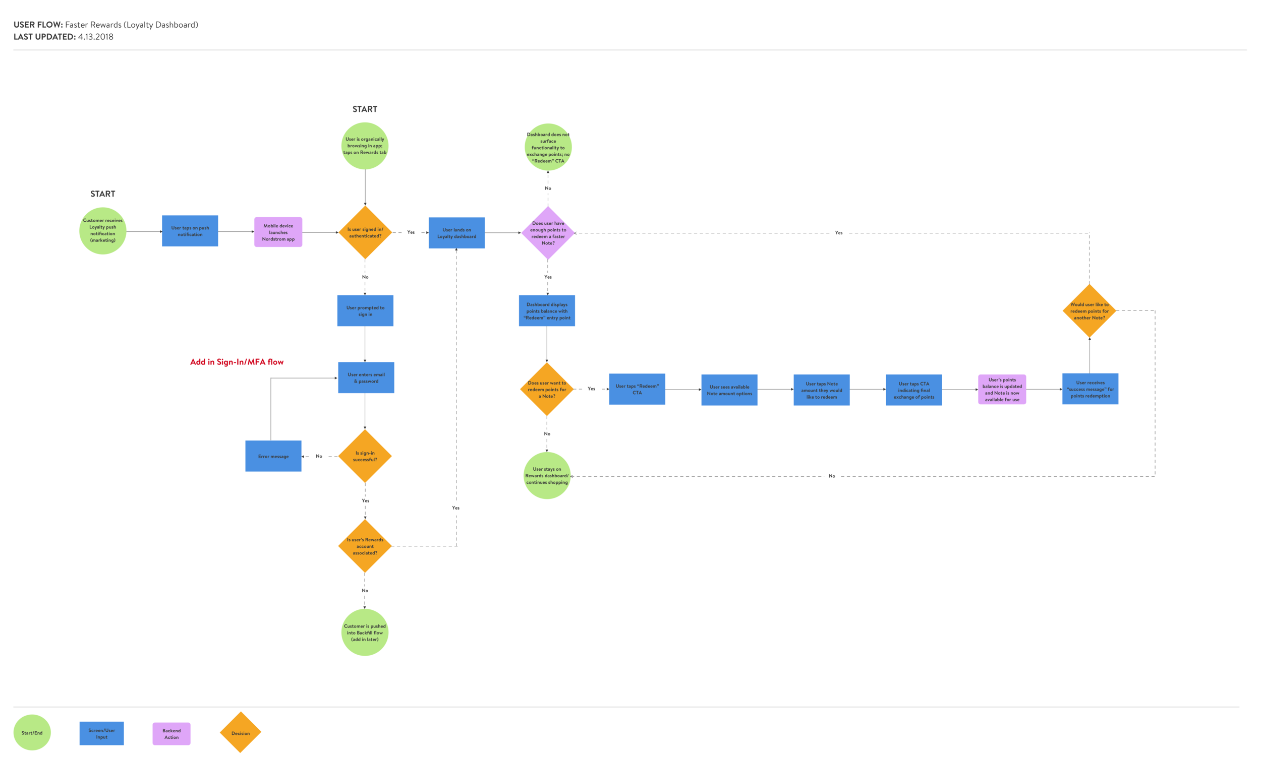
One of the main features that we are focusing on marketing to customers and pushing for them to use is Faster Rewards — allowing customers to trade in points for smaller increments of Notes instead of having to earn 2,000 points and be auto-issued a $20 Note like in the old program. This creation of this feature is in response to the constant feedback we have received from customers: it is too difficult to earn a Nordstrom Note and they don’t hold a lot of value because they aren’t easily accessible for a majority of customers. So, before designing to a dashboard that this feature will live in, it was important to create a user flow to understand how a customer would use Faster Rewards.
Design explorations
Initially, another designer was focusing on the dashboard portion of this project, while I was helping design other flows related to Loyalty. A huge challenge at the point of wireframes, was that the branding for the Loyalty program being executed by the creative agency was extremely delayed. We were not involved in their process whatsoever, so had no idea what to expect or how that would fit in with the Loyalty dashboard. However, because of our time constraints, we had to continue to move forward and test dashboard concepts after our learnings from the card sort.
Below, are explorations (with some FPO branding) done by one of my fellow designers who started out leading the design:


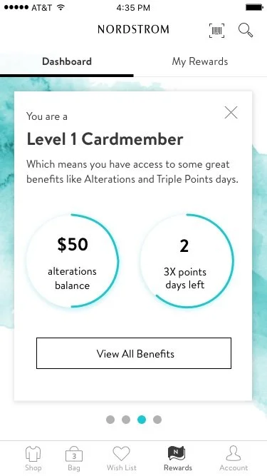

Feedback
01
The cards on the dashboard (screen 1) don’t appear to have a clear hierarchical order.
03
The number within the Notes icon (“4”) is confusing around what it is communicating — does the user have 4 Notes of $80 each? Does it indicate expiration?
05
The Faster Notes modal (screen 2) causes a lot of confusion as to what the customer has available to redeem. In this design, it looks like the customer can redeem a $5 and$10 Note ($15 total), when in reality they only have enough points to cash in for a $5 Note or a $10 Note.
02
What do the $5 and $10 icons represent on the first card? There is no clear relationship between the dollar amounts and the points amount.
04
It is not intuitive for a customer to tap on a card (screen 1), and be able to swipe through the additional cards. It makes it easy for the customer to get lost in the experience and lose a sense of their grounding.
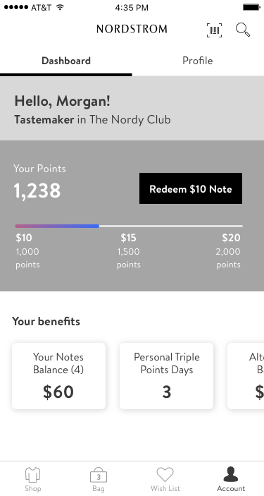
Design explorations II & usability
With these pieces of feedback, my fellow designer explored a different direction that was put through usability. Some key features of the dashboard that was tested was:
Parallax scrolling
Notes section truncated at showing 3 Notes
Circular progress indicators for each benefit
Benefits hidden behind an additional click
Circular & locked dials for the Faster Rewards feature
Spend to next level is shown on dashboard
Results
Positive
01
Users liked the incorporation of the color - it made the experience more exciting
02
They liked having their level at the top of their dashboard, as well as their number of points
03
Customers liked seeing all possible amounts of Notes, but preferred to see the next highest amount they could redeem
Negative
01
Users commented on how they felt there was an excessive amount of scrolling/swiping
02
Users wanted to see all Notes on one page
03
Users had uncertainty in differentiating between informational content and actionable content
04
4-circle design for Faster Rewards caused confusion with customers - they thought they had earned both a $5 and $10 Note, instead of only being able to redeem their points for one
05
Users were confused why the Notes section only displayed 3 Notes max — they wanted to be able to see all available Notes at once
06
Users identified inconsistent use of the progress indicators - they were confused as to how they were used to show dollar amounts, days and points
07
Users still did not understand how many points they were earning per dollar or what the benefits were of reaching the next level
Design explorations III: My own design explorations
After the results of the usability study indicated users were still having trouble understanding the Faster Rewards concept on the dashboard, as well as struggling with efficiently being able to see all of the information concisely, I decided to start from scratch and try to solve the core problems of the previous iterations.
Because some users were getting held up on the visual design of the dashboard designs we tested, I recommended we hold back on the beauty of the visual design, and focus on the meaty design problem: how we are visualizing the information hierarchy. To do this, I began with some simple wireframes:


Feedback
After gathering feedback from other designers, researchers, writers and product partners, I iterated on these designs to come up with a wireframe to put through usability. Here are pieces of feedback I received that influenced the design we decided to test in a usability test with customers:
Having all trackable benefits being aligned to the same side helps the eye parse information more quickly (design 1)
Because points are the most relevant and dynamic information to track, it’s nice to have that be the focal point of the dashboard
Users could potentially want to see all increments of Notes on the progress bar at once (showing 0, 5, 10, 15 at once instead of just 2 increments)
Displaying additional benefits in a scrollable manner helps keep all the important information above the fold
They liked having the action to redeem points for a Note be the most prominent action on the page (design 3 & 4)
Highlighting the customer’s level is important to maintain in the design
It would be nice if customers could directly have access to their Notes on the dashboard (potentially list them?)
Surfacing the actions users can take on the information is nice to have, but could potentially be overwhelming. It could be helpful to prioritize what actions we think users will use the most and have those live on the dashboard permanently (redeem points vs. using a Note vs. scheduling a bonus points day, etc.)
Usability study
Based on the feedback from other designers and the rest of the Loyalty team, we decided to test 3 different versions of wireframes:
1) single page design (left) vs.
2) a tabbed design with dashboard and benefits tabs, with spend to next level on the dashboard vs.
3) a tabbed design with dashboard and benefits tabs with spend to next level on the benefits tab.
Design 1: Single page dashboard
(2 users preferred)
Design 2: Tabbed design with spend to next level under benefits tab
(3 users preferred)
Design 3: Tabbed design with spend to next level on dashboard
(1 user preferred)
Positive
01
Easy for users to find all content areas
Negative
01
Some users felt it was overwhelming
02
The “Redeem” copy seemed confusing
03
Users wanted to see all Notes listed out instead of an entry point to all Notes
Positive
01
“Get a $10 Note” copy was more clear than using a general term like “Redeem”
02
It made sense to users to display the progress of spend to next level on the same page as their level benefits
03
Many liked the entry point to “Start Shopping” by Notes
Negative
01
Users wanted to see more increments of Notes on the progress bar
02
Many users wanted to see the next-level benefits, which we hidden behind a click
Positive
01
Easy for users to find all tracked content
02
Many liked the non-scrollable benefits page and having everything visible in one place
Negative
01
Swipeable graph was not discoverable (graph to see spend to next level)
02
Users didn’t understand the separation of “perks” from “benefits”
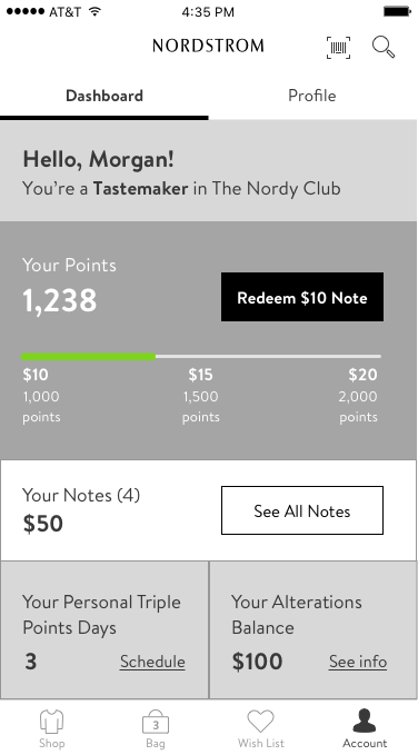
Final designs
After receiving customers’ feedback from usability studies and continuously iterating on these designs, we landed on a solid direction. After the usability testing the wireframe you see above, the initial designer who began working on the dashboard wrapped up this designs execution with heavy influence from her design team members (including myself). At this point, our creative teams and the creative agency they were working with had landed on a color palette for the new Loyalty program, and we were able to add in those colors to help spruce up the Loyalty experience.
-
![]()
01 | No Notes
-
![]()
02 | Notes available
-
![]()
03 | Point redemption
-
![]()
04 | Note redeemed
-
![]()
05 | Benefits
-
![]()
06 | Benefits cont.
-
![]()
07 | Apply for a card


Key design decisions
01
Having a 2-tabbed design (dashboard vs. benefits)
02
Keeping “Points to next Note” progress bar on the dashboard, and show “Spend to next level” progress bar on the benefits tab
03
Having an entry point on the Notes progress bar allowing customers to learn more about the Faster Notes feature
04
Only showing 3 increments of Notes on the Faster Rewards progress bar (amount they just passed, amount the are nearest in reaching, and next possible Note amount)
05
Showing all available Notes on the dashboard
06
Having an entry point to shop on the Notes section
07
On the Benefits tab, showing all benefits in a scrollable tray
08
Showing the benefits of the level above the user’s current level
Reflections
-
If UX has a seat at the table at the beginning of every project, the user’s voice will be heard.
A huge challenge with this project, was UX was not involved whatsoever with the Program Design team when redesigning the program, its new features and it its benefits. Some of these features and benefits that the Program Design team wanted to implement caused a lot of friction in the customer experience. This could have been avoided had UX been involved in this project earlier.
-
No MVP is perfect. That’s the point.
The Nordy Club MVP experience is far from perfect — but knowing that we are launching something that we can continue to iterate on, allows us to learn from our customers when these designs are in the wild. Nothing is perfect the first time, and that’s ok. You continue to build upon it and make it better.
-
Going too high-fidelity too fast distracts from the main question. Does it work?
A mistake our design team made was first testing designs that were too high fidelity. Because both customers and the design team got distracted by its beauty, it took us longer to find out its big usability issues. Starting and testing with wireframes first helps designers not get too married to one design, and allows for changes to be made faster.
-
Nurture your working relationships with your project partners.
Because there was a lot of churn between our Creative partners and the agency we were working with for the program branding, that created a lot of chaos late in the game. This project helped highlight the importance of supporting your project partners in times of chaos — even if we may not be as involved.


Dignissim suspendisse in est ante in nibh mauris cursus mattis. Malesuada fames ac turpis egestas maecenas pharetra convallis posuere. Leo a diam sollicitudin tempor id eu nisl. Proin sagittis nisl rhoncus mattis rhoncus urna neque viverra justo. Adipiscing diam donec adipiscing tristique. Ultrices tincidunt arcu non sodales. Amet purus gravida quis blandit turpis cursus. In hac habitasse platea dictumst. Cras fermentum odio eu feugiat pretium nibh ipsum consequat. Nisi est sit amet facilisis magna etiam tempor. Ipsum nunc aliquet bibendum enim facilisis gravida neque convallis.